Figflow vs Rapid Pages
Compare Figflow vs Rapid Pages and see which AI Design tool is better when we compare features, reviews, pricing, alternatives, upvotes, etc.
Which one is better? Figflow or Rapid Pages?
When we compare Figflow with Rapid Pages, which are both AI-powered design tools, The upvote count reveals a draw, with both tools earning the same number of upvotes. Your vote matters! Help us decide the winner among aitools.fyi users by casting your vote.
Think we got it wrong? Cast your vote and show us who's boss!
Figflow

What is Figflow ?
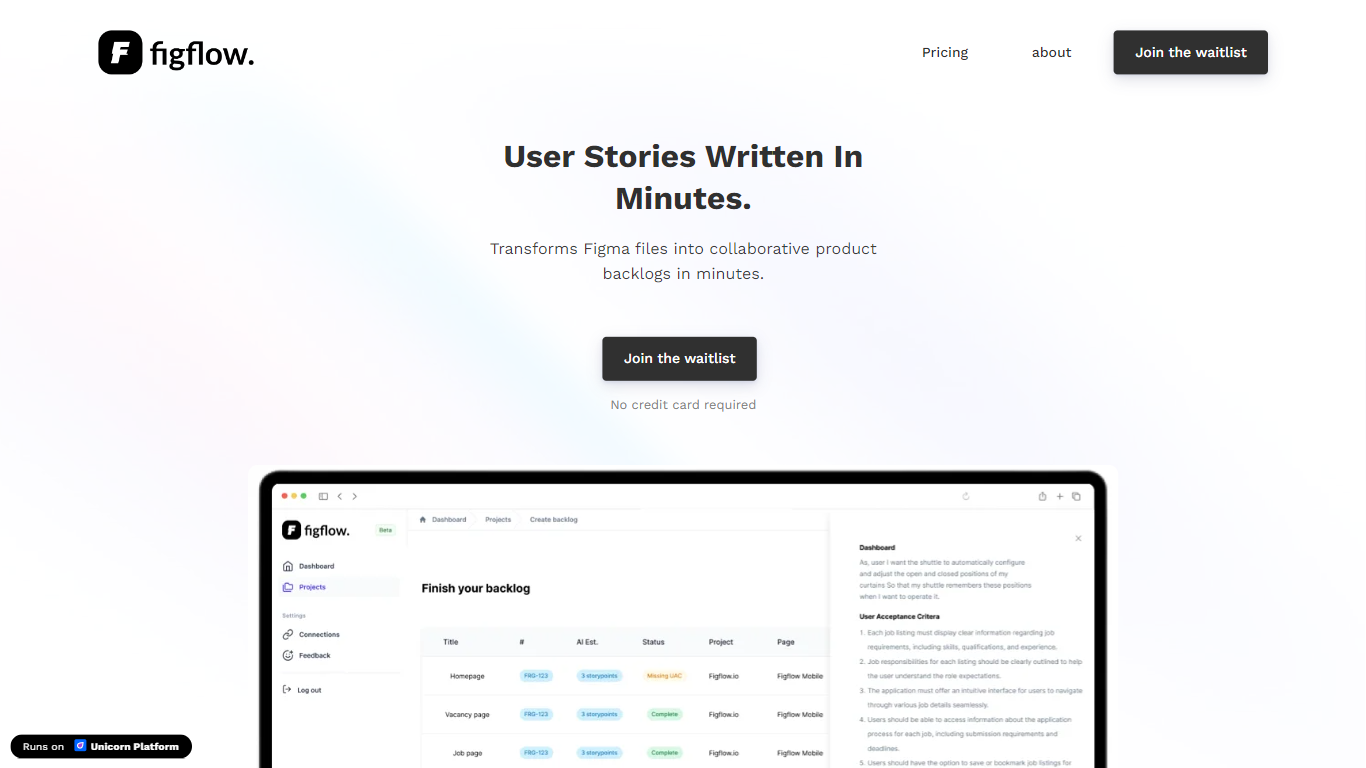
Figflow is an innovative tool designed to simplify the process of creating user stories from design files. It's perfect for product owners, product managers, and product designers who want to save time and enhance collaboration in product development. With Figflow, you can convert your Figma design files into comprehensive product backlogs within minutes, streamlining your sprint planning and execution. This no-hassle solution empowers teams to focus on building, minimizing the tedious task of writing user stories and preparing for development sprints. Whether you're refining user stories for clarity, gathering product requirements, or ensuring that your design smoothly transitions into development, Figflow assists every step of the way. Get ready to enhance your workflow and join the waitlist today—no credit card required!
Rapid Pages
What is Rapid Pages?
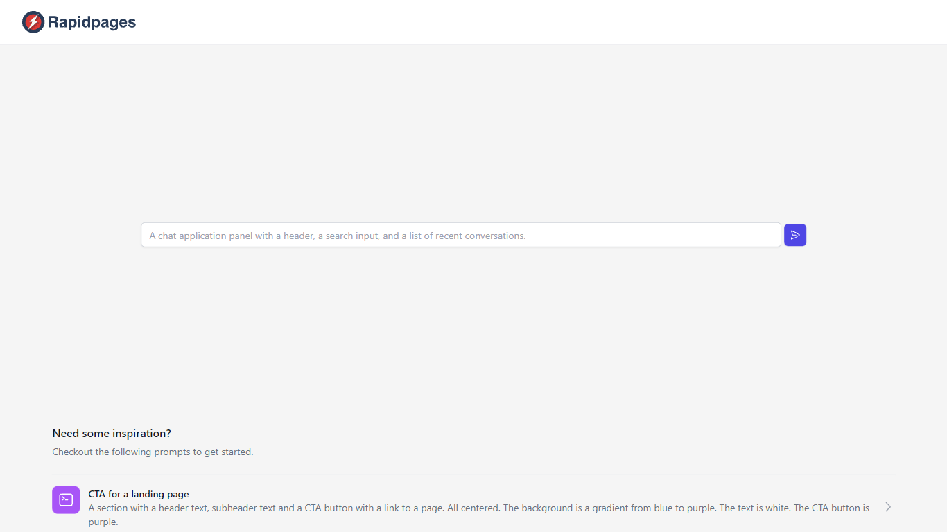
Creating a new component for your website can greatly enhance user experience and engagement. Our creative prompts provide the inspiration you need to design components that are both visually appealing and functionally effective. Whether you're looking to craft a compelling Call to Action (CTA) for your landing page or detailed product cards, this guide will help you conceive and execute your vision.
Starting with a CTA for a landing page, imagine a section that grabs attention with a bold header text, a captivating subheader, and a prominent CTA button that links to a pivotal page of your website. This component is designed to stand out with a stunning background gradient transitioning from blue to purple, while the text remains a crisp white for readability, and the CTA button follows the theme with a deep purple hue.
When it comes to showcasing the features of a product, our layout suggestion includes a section with clear header and subheader texts above a centered 2x2 grid. Each grid cell would succinctly describe a key aspect of your product against a subtle gray background, with text in white to ensure clarity and focus.
Finally, our product card proposal entails a neatly arranged section with two cards at the center, spotlighting the product image, name, description, and a purple CTA button on a clean white backdrop. Black text is recommended to offer a strong contrast, facilitating an effortless reading experience.
Figflow Upvotes
Rapid Pages Upvotes
Figflow Top Features
User Stories Creation: Transforms Figma files into collaborative product backlogs in minutes.
Manual Work Reduction: Refines user stories to streamline sprint planning and execution.
Insights Gathering: Helps product managers easily collect product requirements and communicate with stakeholders.
Design to Development Transition: Seamlessly generates user stories from Figma files for a smooth process.
No Credit Card Required: Join the waitlist without any upfront payment requirement.
Rapid Pages Top Features
Inspiring Prompts: Specific prompts to kickstart your design process for website components.
CTA Design: Guidance for creating compelling CTAs with focused design elements.
Product Features Layout: A structured 2x2 grid layout to detail product features effectively.
Product Cards Template: Recommendations for designing informative and appealing product cards.
Visual Aesthetics: Tips on color schemes and text contrast to enhance user interaction and visual appeal.
Figflow Category
- Design
Rapid Pages Category
- Design
Figflow Pricing Type
- Freemium
Rapid Pages Pricing Type
- Freemium